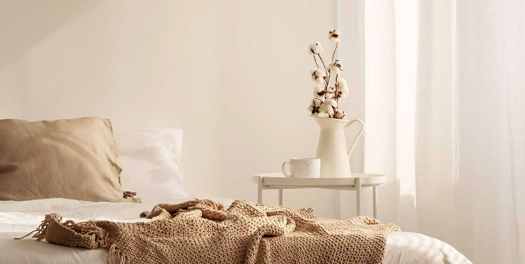
Would you mix creams into the whites in your space? This latest color trend has quickly become our favorite, as it adds variation, depth, and a touch of coziness while still keeps the palette on the minimal end. A dose of cream softens the sharp contrast between black and white, bringing the black some warmth and the white a luminous glow. Cream is also a color that comes directly from the nature and therefore minimizes the environmental impact - think unbleached cotton, un-colored wool and alpaca fleece, original wood, raffia, and other plant fibers. Play with the shades of cream and you can never go wrong!


Images from top left: 1: Tom Delavan; 2: Milk and Honey Rug; 3: Nuda Throw; 4: Pinterest; 5: Apartment34; 6: Prong Bowl, Speckled; 7: Chikuno Cube House, Small; 8: Lacey Chaus Interiors; 9: Little Blue Cloud; 10: Lorena Alpaca Stuffed Animal; 11: Mini Cotton Throw; 12: Lisa Keophila; 13: Ribbon Bath Mat; 14: Napkin Ring, Set of 4; 15: Farm Table Napkins, Set of 2; 16: My Scandinavian Home; 17: Carnet de Bohème Sham; 18: Pinterest; 19, 20: My Scandinavian Home; 21: Kasba Throw; 22: Rebari Khadi Lumbar Pillow; 23: Fredrik Karlsson Interiors; 24: VosgesParis; 25: Paramo Wool Pillow; 26: Stripe Raffia Basket.